
Civic data portal examples: a researcher's field guide to real open data portals

Yoana Popova
Tl;drWe're building what we believe should be the best civic data portal on the web — and we're doing the research to back it up. This article is the first in an ongoing series documenting that process: studying real civic portals in the wild, identifying what actually works for researchers, journalists, and planners, and feeding those findings directly into our own exemplar build. You can follow our progress here: civic.portaljs.com
What does a good civic data portal actually do?
The answer is not "has a search box" or "looks modern." A useful civic portal helps a person answer a concrete question with evidence. It gives them a path from curiosity to dataset, from dataset to context, and from context to action.
The questions researchers actually bring to civic portals look like this:
- Is a building using too much energy?
- Are bike counts rising on a protected route?
- Which streets have the most crashes?
- Where is the city spending money?
- What public-safety events happened, and when?
- What is the status of a sidewalk gap or water line replacement?
If a portal cannot support those questions without a lot of manual work, it is not yet doing the job. That is the standard we applied when studying a set of live civic portals — and it is the standard we are trying to meet with our own exemplar build at civic.portaljs.com.
This guide reviews 12 live civic data portals in detail — screenshots, platform attribution, and specific features — so you can see what good looks like before building or evaluating your own.
How We Evaluated These Open Data Portals
We chose portals based on a simple idea: a portal is only useful if the data can actually be used. We focused on portals that showed some combination of raw exportable data, time series or geographic data, dashboards or stories that explain the data, clear pathways for both non-technical and technical users, and visible evidence of ongoing maintenance.
That last point matters more than it looks. A portal can be visually polished and still be a dead end if it hides the underlying data, locks everything inside maps, or stops updating.
We then compared these eight portals against six larger benchmark portals — Toronto, data.gov.sg, NYC Open Data, London Datastore, Helsinki Region Infoshare, and Melbourne — to identify patterns that hold at scale. Following open data portal best practices isn't just about choosing the right software — it is about how the portal is maintained, how the data is described, and how users of different skill levels are guided through it.
4 Design Patterns That Make Civic Data Portals Actually Work
1. Homepages that reflect user intent. Search only works if you already know what you're looking for. The best portals give users multiple entry points: topic browsing, dashboards, maps, stories, and API paths. (Best examples: Toronto's category-first navigation, Singapore's live usage metrics, Ann Arbor's split paths for datasets, maps, and dashboards.)
2. Raw data and explanation together. A dashboard explains why a dataset matters. The raw export lets researchers verify the claim. Portals that force a choice between "data" and "story" are weaker than those that offer both. (Best examples: Ann Arbor's explicit "dashboards complement raw datasets" framing, Melbourne's Data Stories, data.gov.sg's in-portal interactive charts.)
3. Participation strengthens one-way publishing. Portals that let users request data, submit stories, or see reuse examples signal a living public process. Cary, Toronto, and Helsinki all show this at different scales — from a local submission form to a national gallery of credited reuse. (Best examples: Cary's Submit a Story flow, Toronto's dataset request tracker, data.gov.sg's Public Creations section.)
4. Transparency requires connecting systems. People think in terms of spending, projects, and service quality — not "catalogs." The best portals surface those connections even when the underlying systems are separate. (Best examples: Roseville's budget and projects links, Murfreesboro's separated budget, checkbook, and payroll surfaces.)
8 Civic Data Portal Examples Worth Studying
Each portal in the table below is strong at something specific. That is exactly why studying them together is useful — the patterns only become visible when you compare across different city government open data programs.
| Portal | Strongest at | Primary research use case | Platform |
|---|---|---|---|
| Ann Arbor | Dashboards, maps, and datasets in one structure | Energy, water, crash, tree, and infrastructure trends | PortalJS |
| Cary | Participation and publishing workflows | Request missing data, submit stories, create maps and charts | Opendatasoft |
| Vancouver | Exploration tools for non-technical users | Move from dataset to chart or map without downloading first | Opendatasoft |
| Roseville | Connected transparency ecosystem | Link spending data to budgets and capital projects | Socrata |
| Norman | Narrowly scoped public-safety accountability | Calls for service, collisions, complaints, contacts, and offenses | City website |
| Murfreesboro | Separated public finance surfaces | Budget, checkbook, and payroll comparison | Socrata |
| Toronto | Community engagement ecosystem | Dataset requests, events, gallery projects, and reuse | CKAN |
| data.gov.sg | National-scale reuse and live data access | APIs, live charts, subscriptions, and popular dataset discovery | Custom |
| NYC Open Data | Audience segmentation by expertise level | Separate paths for beginners, veterans, and developers | Socrata |
| London Datastore | Editorial framing around datasets | People, Economy, Places, Insights, and Area Profiles | DataPress |
| Helsinki Region Infoshare | Regional collaboration and reuse | Datasets, APIs, showcases, and data requests across agencies | CKAN |
| Melbourne | Outcome-oriented navigation | Analysis, visualisation, stories, and API access in one flow | Opendatasoft |
Ann Arbor: Connecting Exploration to Evidence
Ann Arbor's portal is the clearest example in this review of a portal that treats dashboards as a complement to raw data — not a replacement for it. The homepage makes this explicit: "Our dashboards provide visualization and analysis, complementing our raw datasets." That framing matters. It tells users the visual layer is not the whole product.
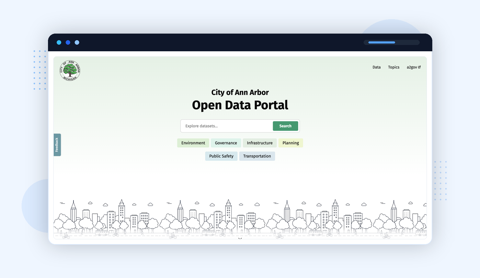
Platform: PortalJS · data.a2gov.org
What makes Ann Arbor particularly useful for researchers:
- dashboards, maps, and datasets are separated as distinct navigation paths
- dashboards are tied to specific civic questions, not generic widgets
- topics covered include energy benchmarking, traffic crashes, street trees, water service lines, rainfall, air quality, and solid waste
- maps and dashboards provide enough context to understand the data before downloading anything
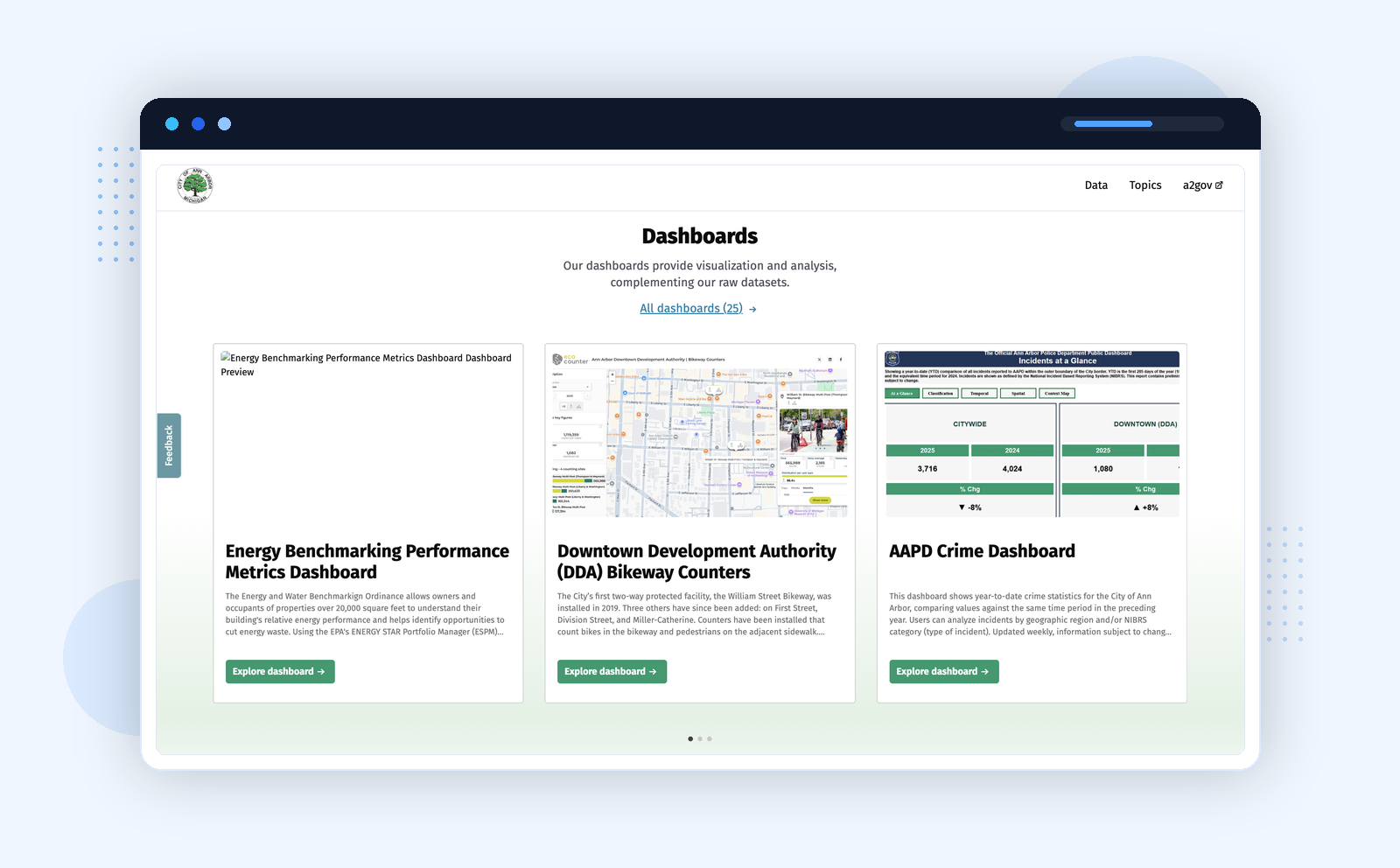
Research scenarioA policy researcher wants to know whether a street redesign or tree-planting program is having measurable effects. Ann Arbor provides a path from dashboard to map to raw dataset — without leaving the portal.
Cary: Treating the Public as Participants
Cary's portal is the strongest example of participation-first design in this guide. The navigation — Catalog, Create a Map, Create a Chart, Suggest Data, Data Stories, Submit a Story — maps directly to different user intents.
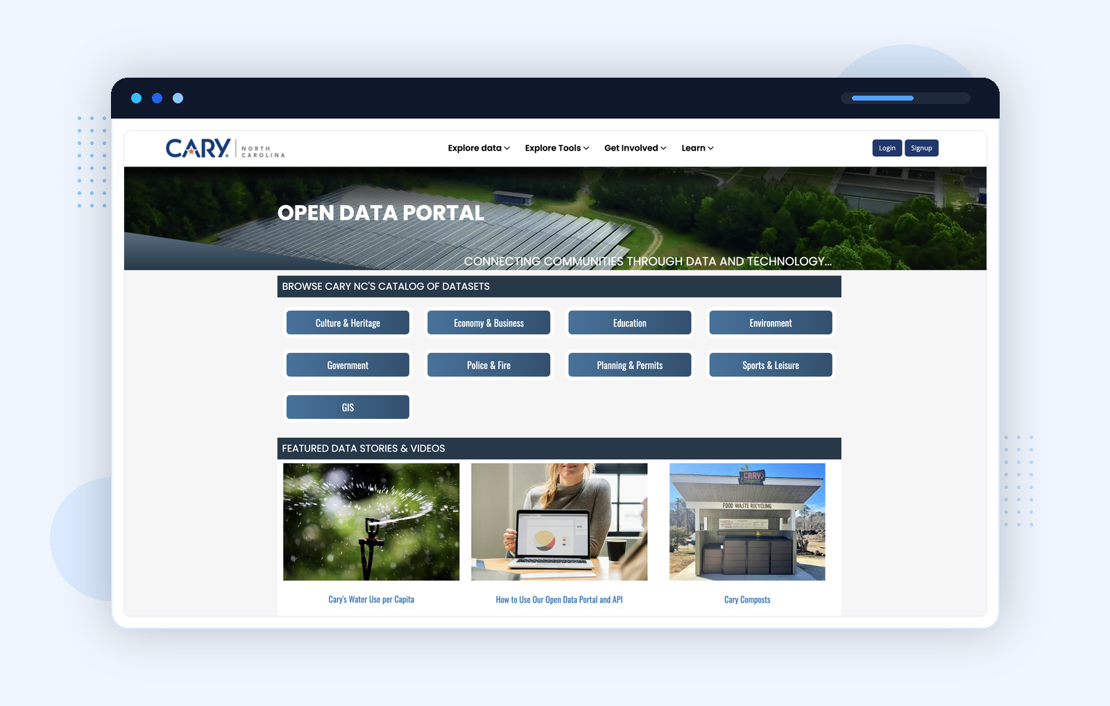
Platform: Opendatasoft · data.townofcary.org
- Browse if you're exploring what exists
- Build if you want to interrogate the data yourself
- Request if what you need isn't in the catalog
- Submit if you have evidence worth sharing back with the city
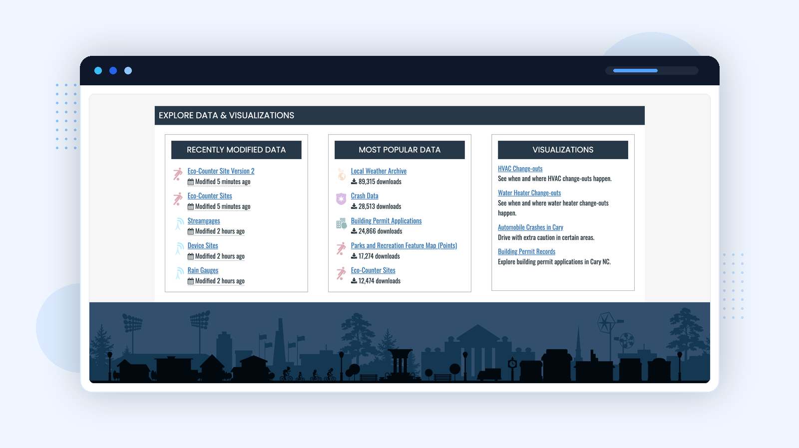
Research scenarioA journalist or content creator wants to turn local data into a story without writing code. Cary's "Submit a Story" and "Create a Chart" paths give them both — and the city gets a public narrative built on its own data.
Vancouver: Reducing the Gap Between Discovery and Analysis
Vancouver's portal addresses a specific friction point: many users do not want to download a CSV before knowing whether the data is worth their time. The homepage immediately splits users into New users and Advanced users, and surfaces Chart builder and Map builder as top-level tools — letting users see the shape of the data before committing to a download.
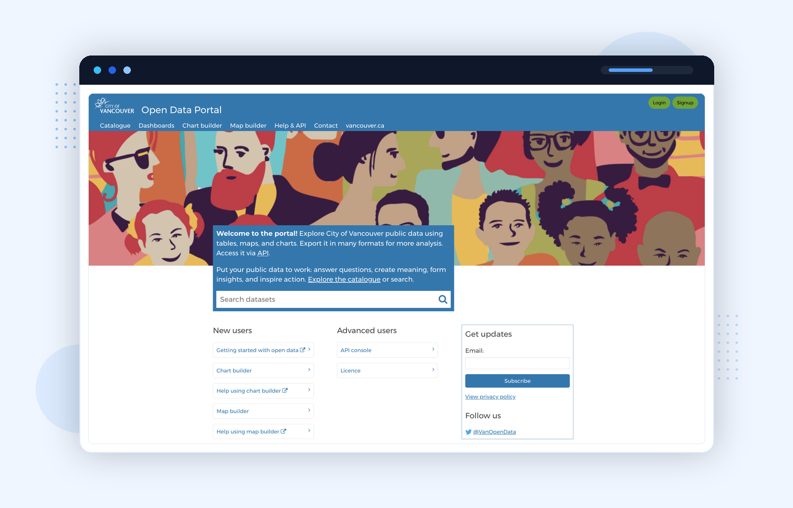
Platform: Opendatasoft · opendata.vancouver.ca
Research scenarioAn analyst working on neighbourhood mobility starts in the catalog, moves into the map builder, and only then decides whether the raw dataset warrants pulling into a notebook.
Roseville: Transparency Requires Connecting Systems
Roseville's portal keeps a conventional dataset catalog on the surface, but its useful pattern lies elsewhere: the portal connects to an open budget view and open projects view. Civic questions rarely fit inside a single catalog. Someone asking about a road project wants to know what was approved, what has been spent, what projects are active, and what changed in their neighbourhood.
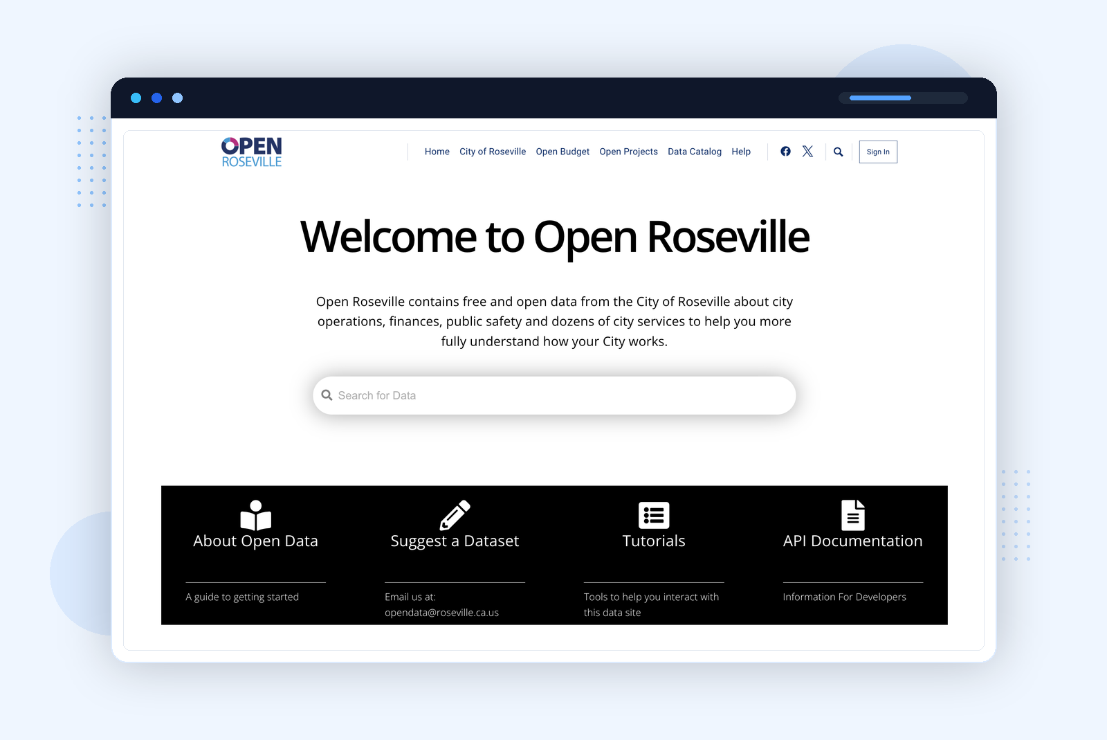
Platform: Socrata (Tyler Technologies) · data.roseville.ca.us
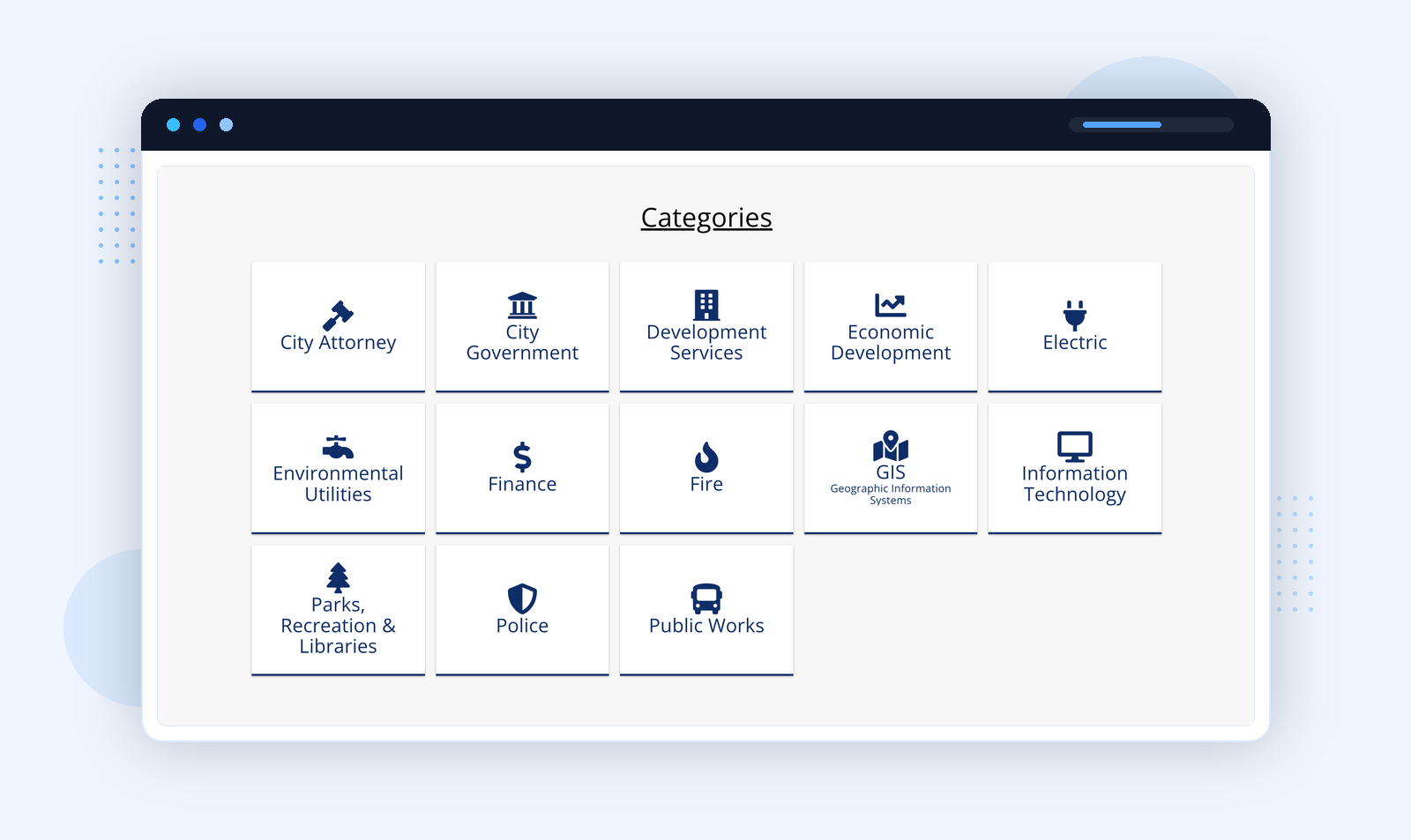
Research scenarioA resident wants to understand a local road project and the budget behind it. A portal that connects spending data to project status is significantly more useful than a standalone dataset list.
Norman: The Value of Deliberate Scope
Norman's portal is not a broad citywide data portal. It is a public-safety-focused portal — and that narrowness is part of what makes it useful. The Norman Police Department portal explicitly states its purpose: transparency, community trust, and accountability. It publishes calls for service, collisions, complaints and inquiries, contacts, and offenses on a quarterly update cycle.
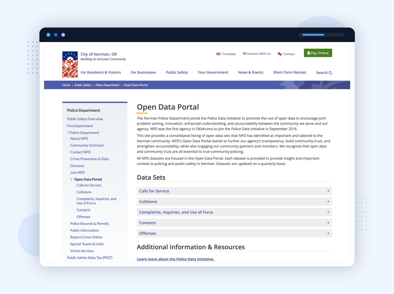
No dedicated platform — data hosted directly on the city website · normanok.gov
The collision dataset page is a good example of how this works in practice: it explains what the data includes, how it is structured, and when it was last updated — before asking anyone to download anything.
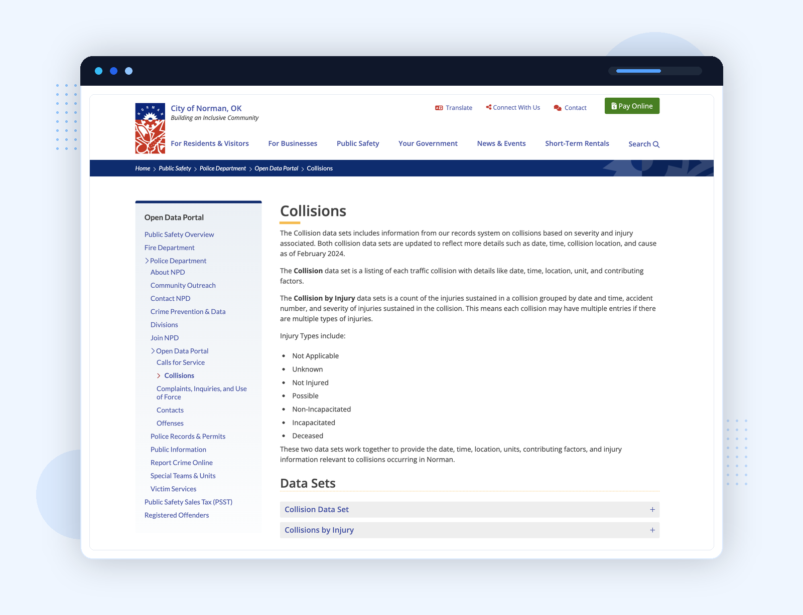
This is worth noting for any city considering what scope to start with. A high-quality, narrowly scoped portal with clear maintenance and genuine context is more valuable to researchers than a sprawling catalog with weak provenance and no narrative.
Research scenarioA resident or journalist wants to track public-safety trends in their neighbourhood over time. Norman publishes calls for service, collision, and complaint data on a quarterly cycle — enough for a longitudinal analysis without requiring a custom data request.
Murfreesboro: Finance Data Needs Its Own Structure
Murfreesboro's open finance portal separates budget, checkbook, and payroll into distinct surfaces. The current fiscal year data updates nightly; previous years show complete fiscal data. That level of explicitness about update cadence and scope is rare, and it matters for anyone trying to do longitudinal budget analysis.
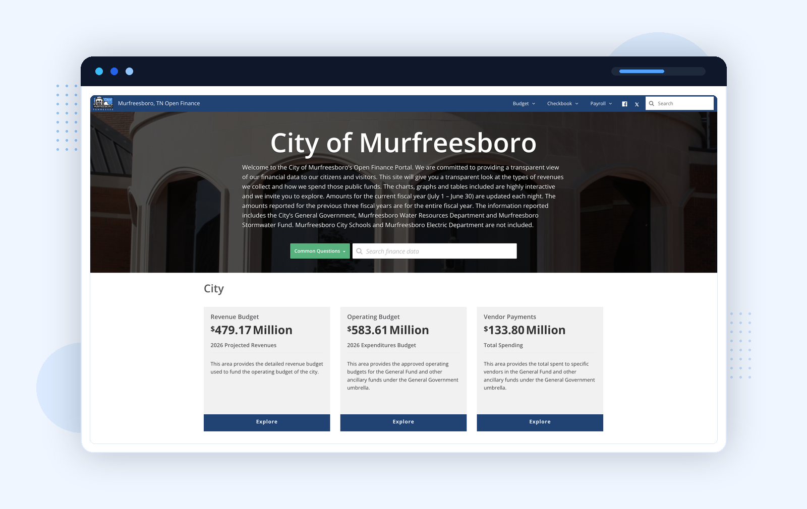
Platform: Socrata (Tyler Technologies) · murfreesboro.finance.socrata.com
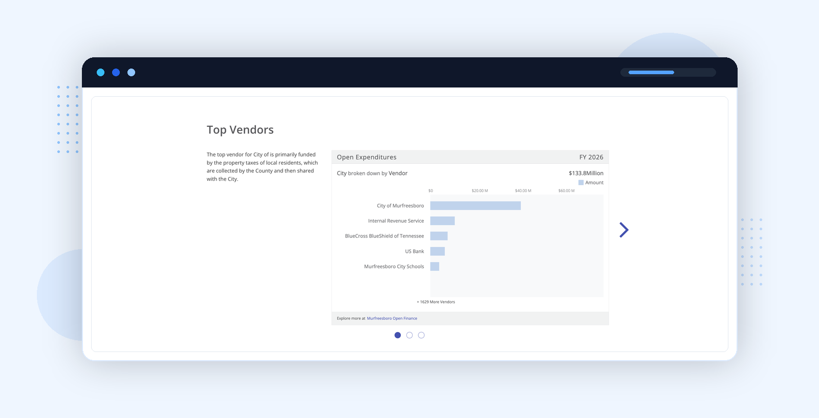
Research scenarioA journalist or budget analyst wants to compare operating budget lines against actual expenditures. Murfreesboro gives them a cleaner route than a generic civic data search — and tells them exactly how fresh the data is.
6 Best-in-Class Open Data Portals: Toronto, Singapore, NYC, London, Helsinki, Melbourne
These six larger portals show what happens when a city government open data program has to serve a broad public at scale and sustain itself as a public institution over time.
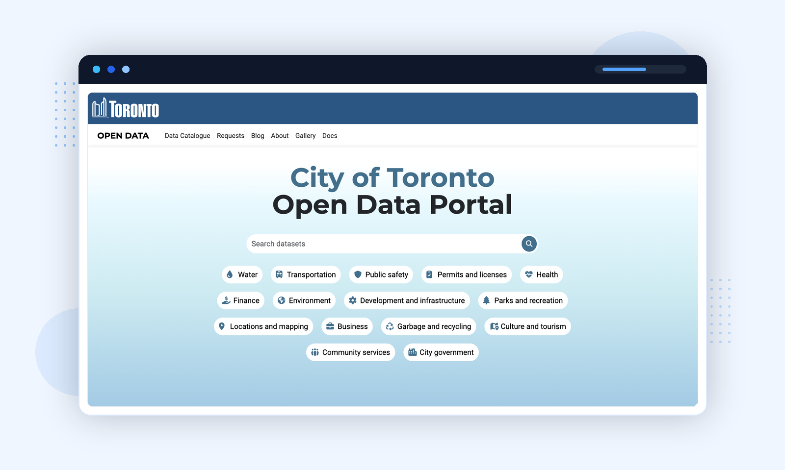
Toronto Open Data treats its portal as a civic program, not a catalog service. Built on CKAN, it integrates dataset requests, a community blog, a project gallery, documentation, and public event submissions under one roof.
Platform: CKAN · open.toronto.ca
Category-first navigation
Instead of defaulting to keyword search — which only works if you already know what exists — Toronto leads with topic clusters that map to how citizens and researchers actually think about civic questions. The dataset request feature creates an accountability loop: citizens propose new datasets and can track whether they get fulfilled. The project gallery turns the catalog into evidence of civic reuse rather than a static file archive.
data.gov.sg is the most technically sophisticated portal in this review. Built by Singapore's Open Government Products team, it approaches open data as a data product — not a file repository — with 4,500+ datasets from 70+ agencies accessible via live charts, APIs, and dataset subscriptions.
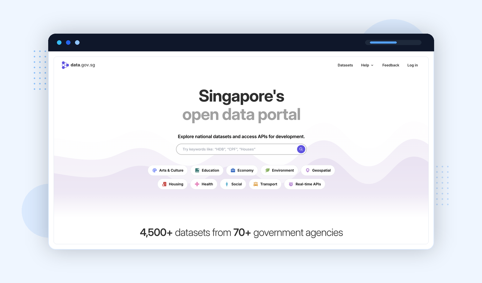
Platform: Custom (Open Government Products) · data.gov.sg
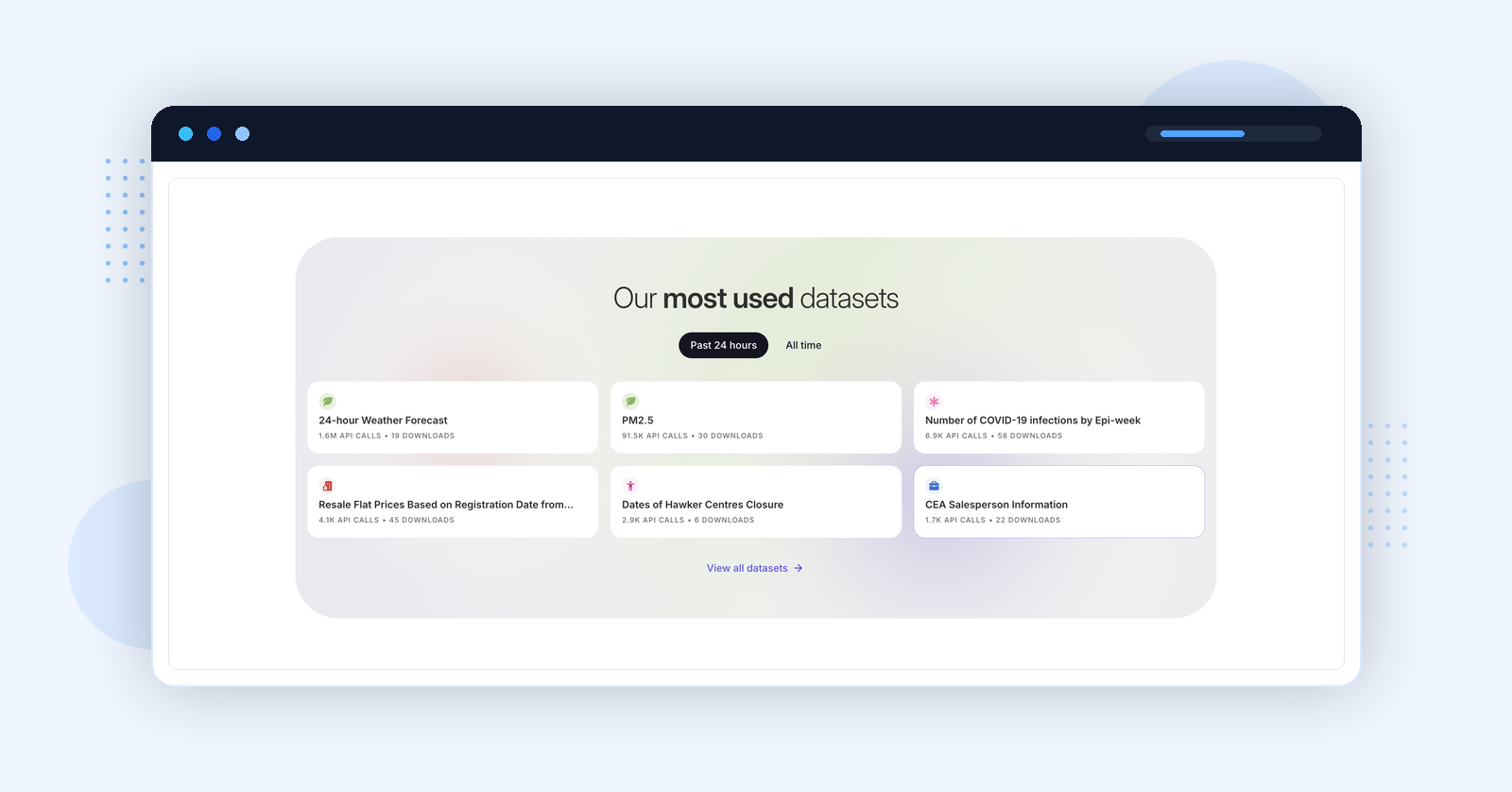
Live usage metrics
The homepage surfaces API call counts and download volumes per dataset in real time. A dataset with 1.6M API calls in 24 hours has clearly been validated in production — this is a signal of data quality that no metadata field can replicate, and it makes the most actively trusted datasets immediately discoverable.
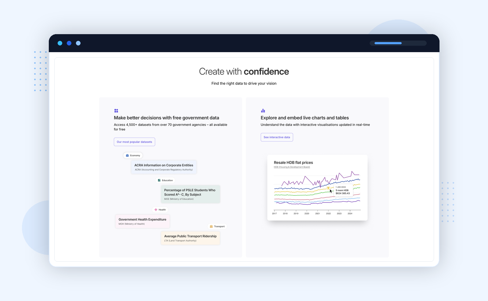
Interactive exploration before download
Every dataset can be visualised in-portal — live charts and tables updated in real time — before committing to a download. A journalist or analyst can verify whether the data tells the story they expect without opening a spreadsheet or writing a line of code.
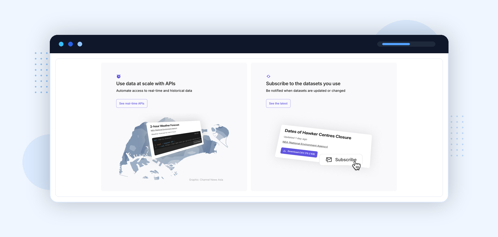
Dataset subscriptions
Users can subscribe to receive notifications when a specific dataset is updated — a feature none of the other portals in this review offers as a first-class product. For longitudinal research tracking housing prices, transport ridership, or environmental metrics over months, this is the difference between manual checking and automated awareness.
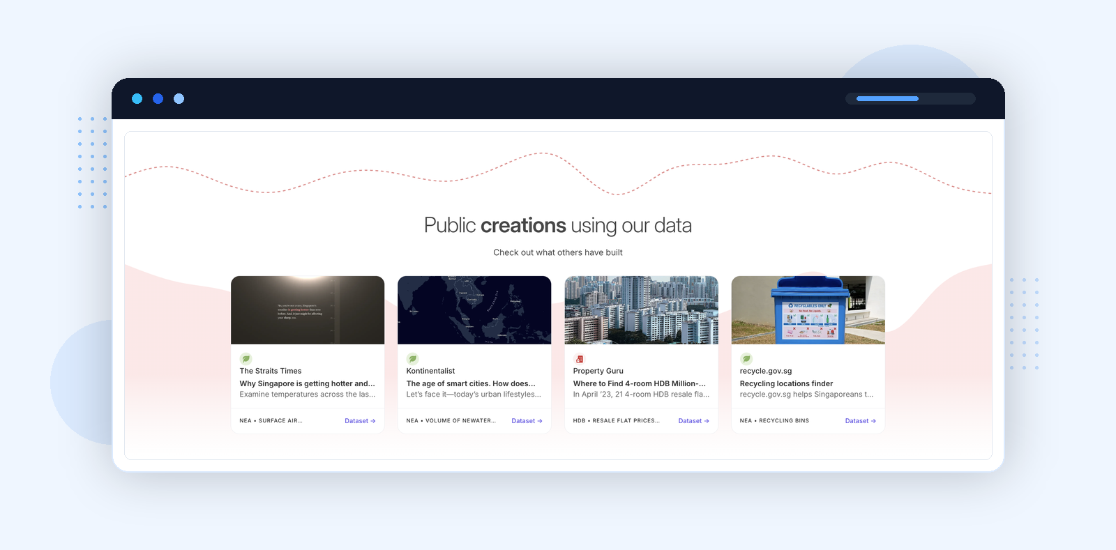
Public creations with attribution
The public creations section documents real reuse with source attribution: The Straits Times, Kontinentalist, Property Guru, recycle.gov.sg — each linked to the specific dataset used. This is not a "possible use cases" page. It is evidence. It turns the portal into a visible layer of Singapore's civic information infrastructure.
NYC Open Data explicitly differentiates its audience from the first page — a design choice that sounds obvious but is rare in practice. Most civic portals present a single interface and expect all users to find their own way in. The portal also runs Open Data Week, an annual public event, signalling that open data is treated as a civic institution rather than a backend service.
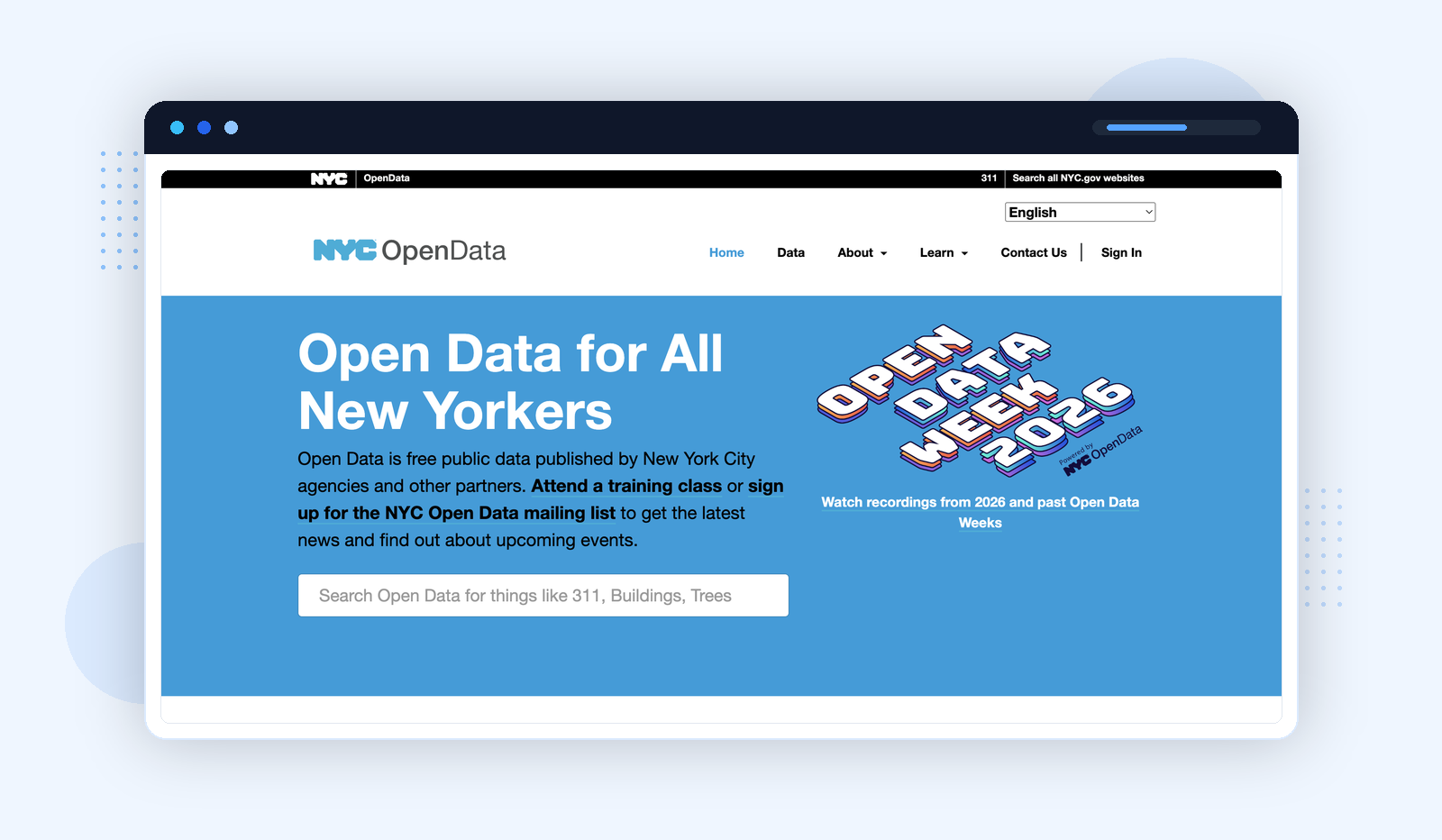
Platform: Socrata (Tyler Technologies) · opendata.cityofnewyork.us
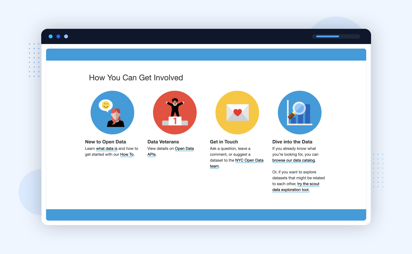
Audience segmentation
The "How You Can Get Involved" section divides users into four distinct paths: New to Open Data (guided How To), Data Veterans (direct API access), Get in Touch (dataset requests and feedback), and Dive into the Data (direct catalog browse). Each path assumes a different level of familiarity and intent. A portal that forces all four groups through a single search box will consistently fail at least three of them.
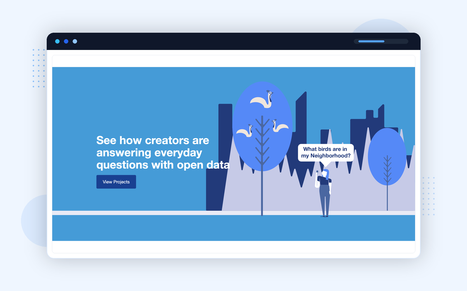
Project gallery
The gallery does two things at once. For new users, it demonstrates that the data is real and useful — people have built meaningful things with it. For experienced users, it shows what is possible beyond basic queries. The framing — "See how creators are answering everyday questions with open data" — is deliberately accessible: not just enterprise applications, but everyday civic questions answered with public data.
London Datastore treats data publication as an editorial act. The top-level navigation — People, Economy, Places, Insights, Area Profiles — organises datasets around the questions a policy researcher or journalist actually asks, not around the departments that published them.
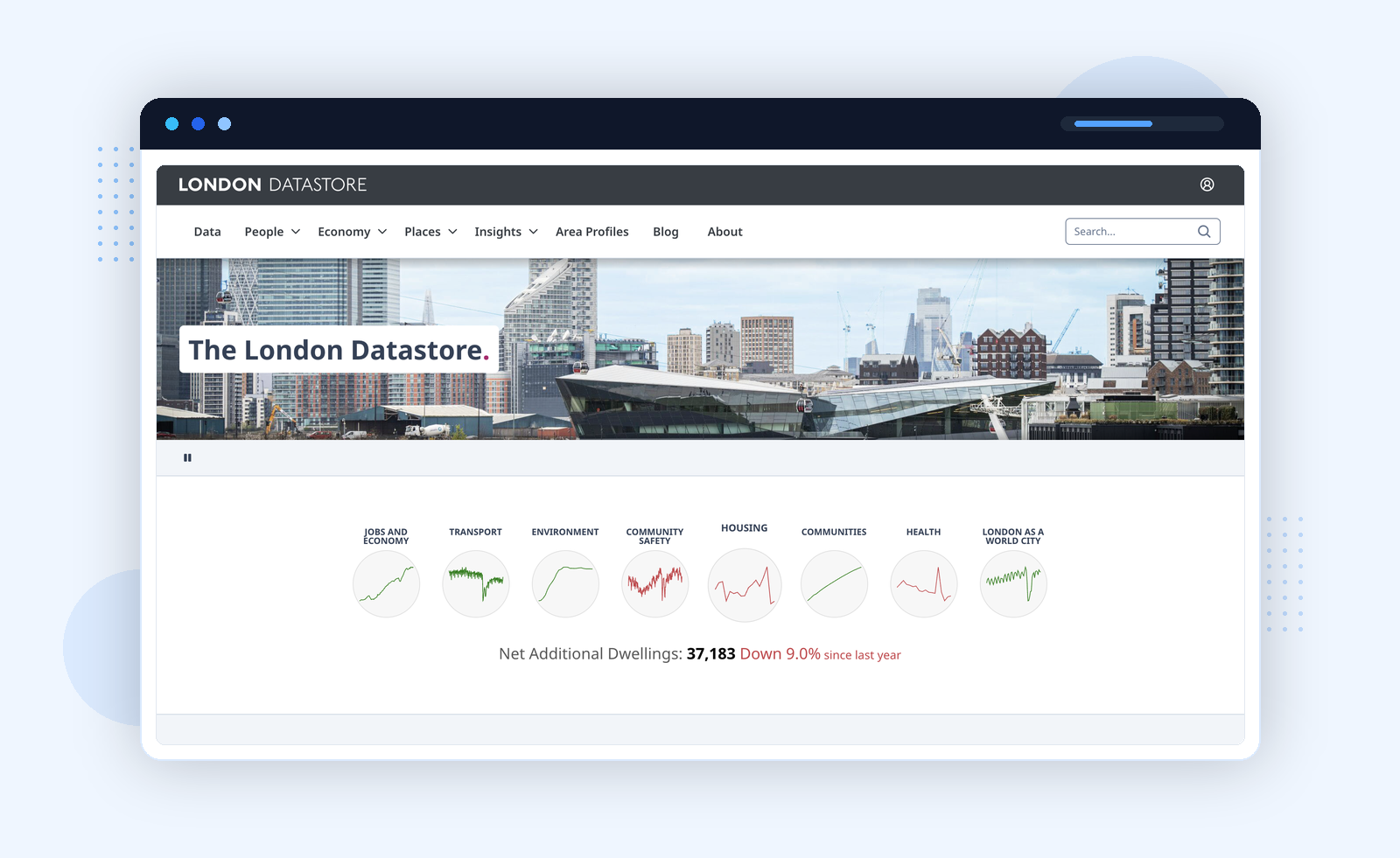
Platform: DataPress · data.london.gov.uk
Topic sparklines
The small line charts on the homepage — one per category — show trend direction before a user has clicked anything. A researcher interested in Housing or Community Safety gets a visual signal that the data exists, is current, and is moving. It is a subtle but effective way to communicate portal health at a glance.
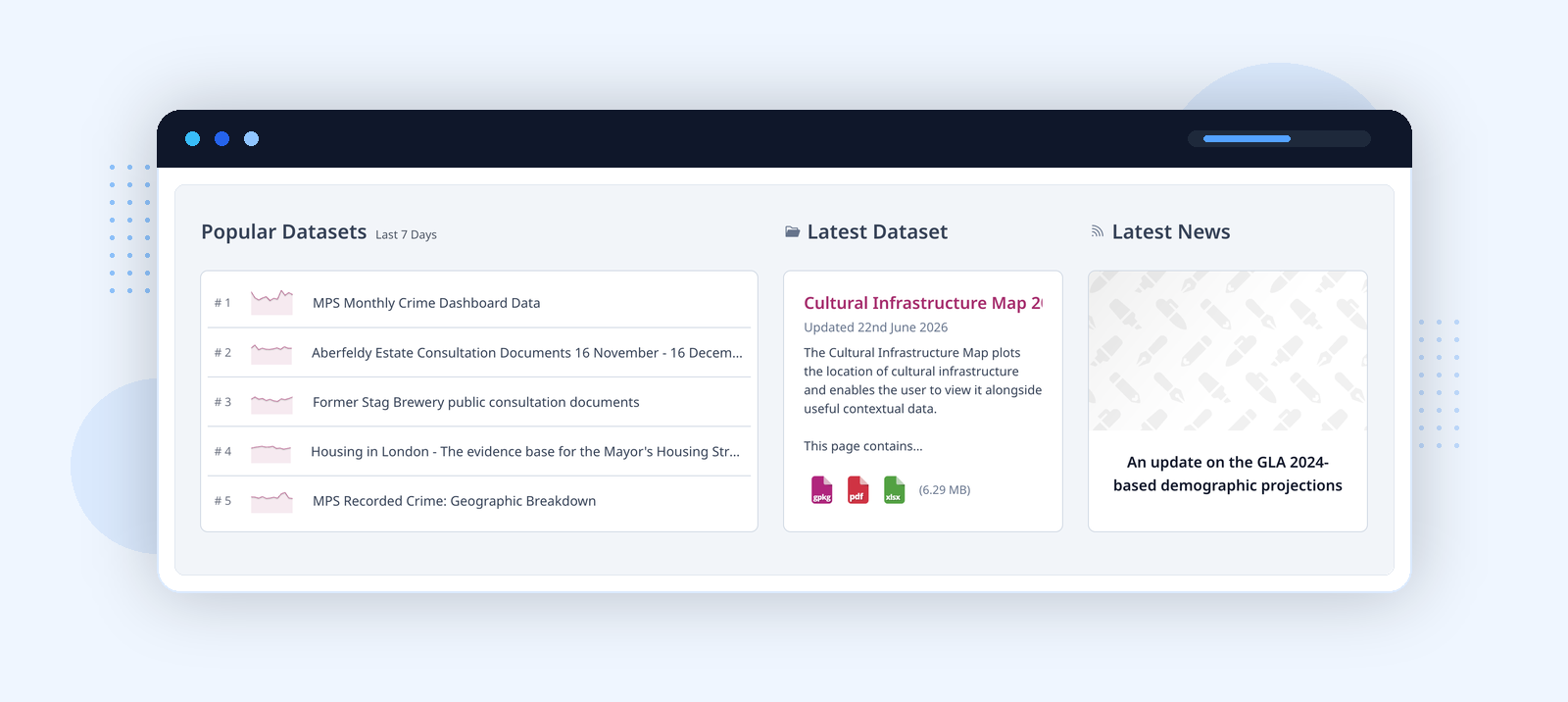
Popular datasets and editorial curation
The popular datasets panel functions as a low-effort discovery layer for researchers who do not know where to start. The "Latest Dataset" and "Latest News" panels sit side by side, treating new data publication and editorial commentary as equally important outputs. Area Profiles — geographic snapshots aggregating statistics about a specific borough — let planners and journalists answer spatial questions without building a custom query. This is closer to how a newsroom thinks about data than how most government IT departments do.
Helsinki Region Infoshare aggregates open data across Helsinki, Espoo, Vantaa, and Kauniainen under a single portal. This regional model is harder to build than it looks — it requires cross-municipality data agreements, shared metadata standards, and a common publishing workflow — and it has a measurable payoff: a study of the wider Helsinki metro area requires one portal, not four.
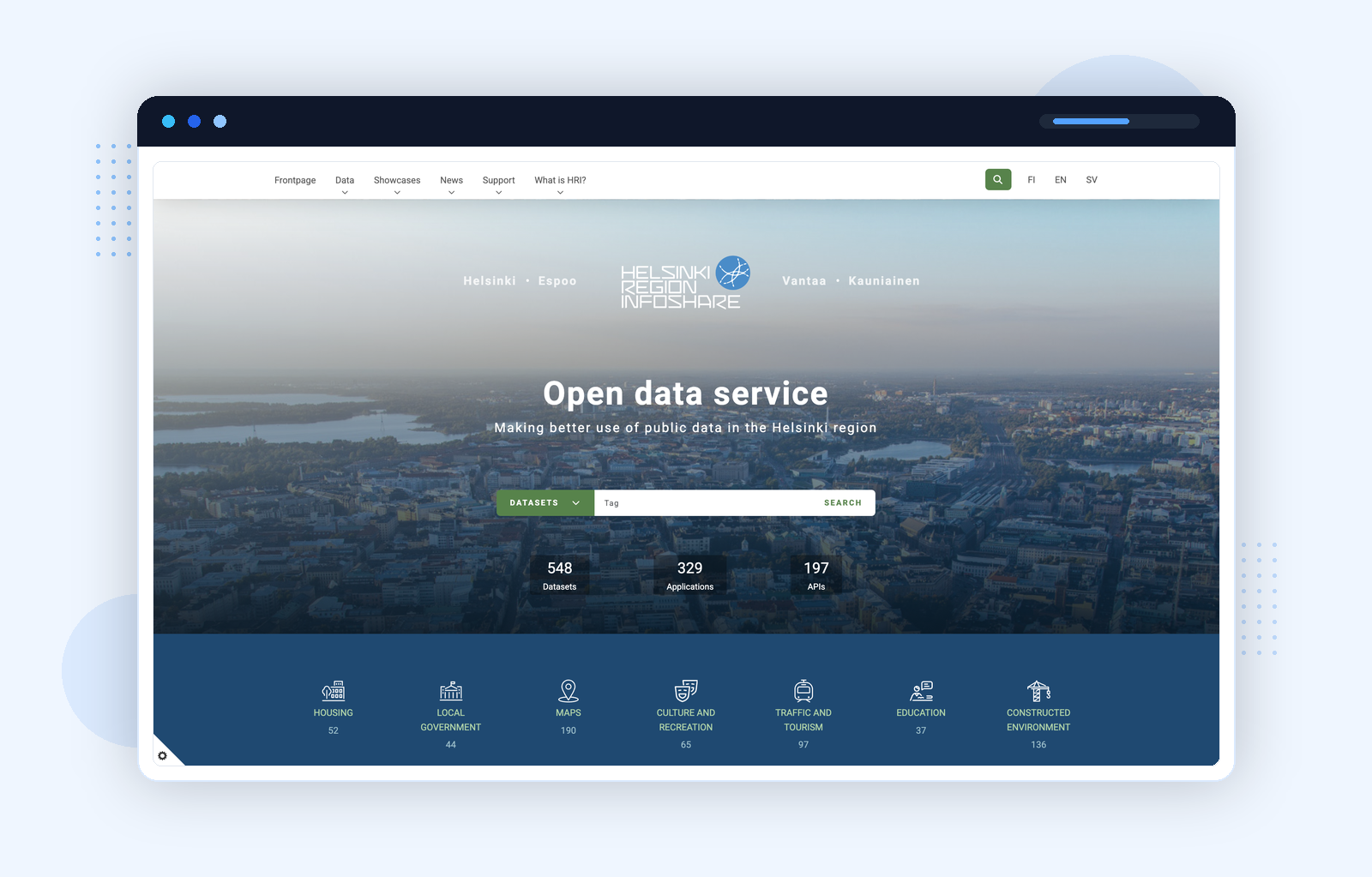
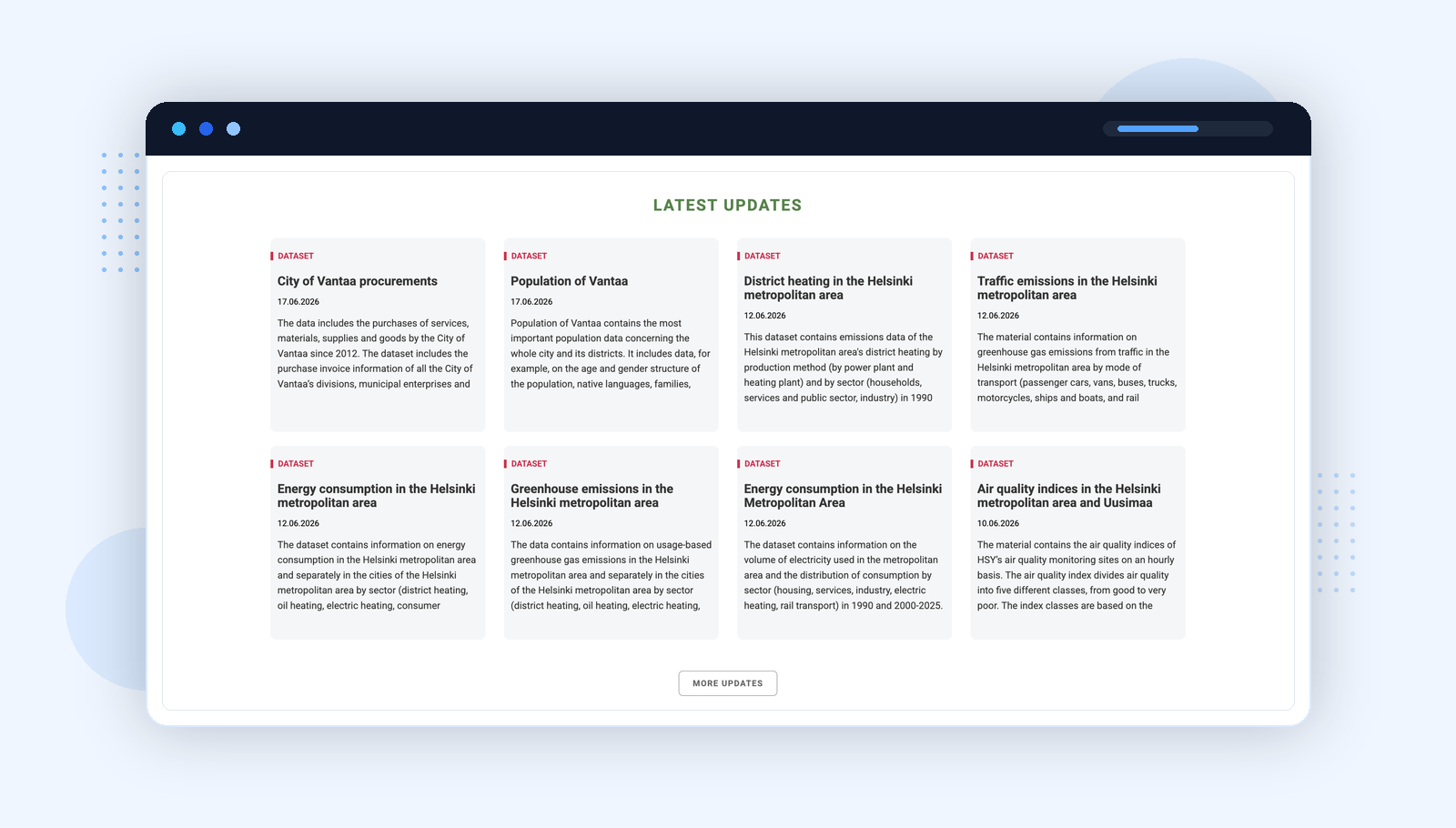
Dataset freshness at a glance
The updates grid shows dataset titles, publishers, and publication dates. A researcher can assess data currency before clicking through. The thematic depth is also visible here: City of Vantaa procurements, population data, district heating emissions, traffic emissions, greenhouse gas data — datasets that support serious policy research, not just public curiosity.
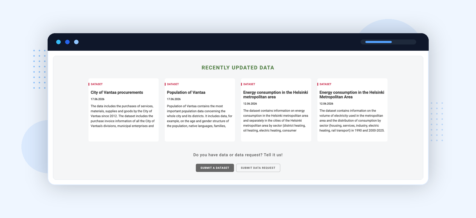
Participation built into the interface
The "Do you have data or a data request? Tell it us!" call to action appears immediately below the most recently updated datasets — not buried in a contact form or help page. It is visible to the researcher who just noticed a specific dataset is missing or out of date, at the moment they notice it. This is a small UX decision with a significant effect on participation rates.
Melbourne keeps navigation action-oriented: Explore our Data, Analysis and Insight, Visualise our Data, Data Stories, Our API, Help — every entry point is framed around what a user can do with the data. The sensor data category is notable: Melbourne publishes live IoT feeds from city infrastructure, including pedestrian counts and microclimate sensors — more technically rich than most civic portals in the English-speaking world.
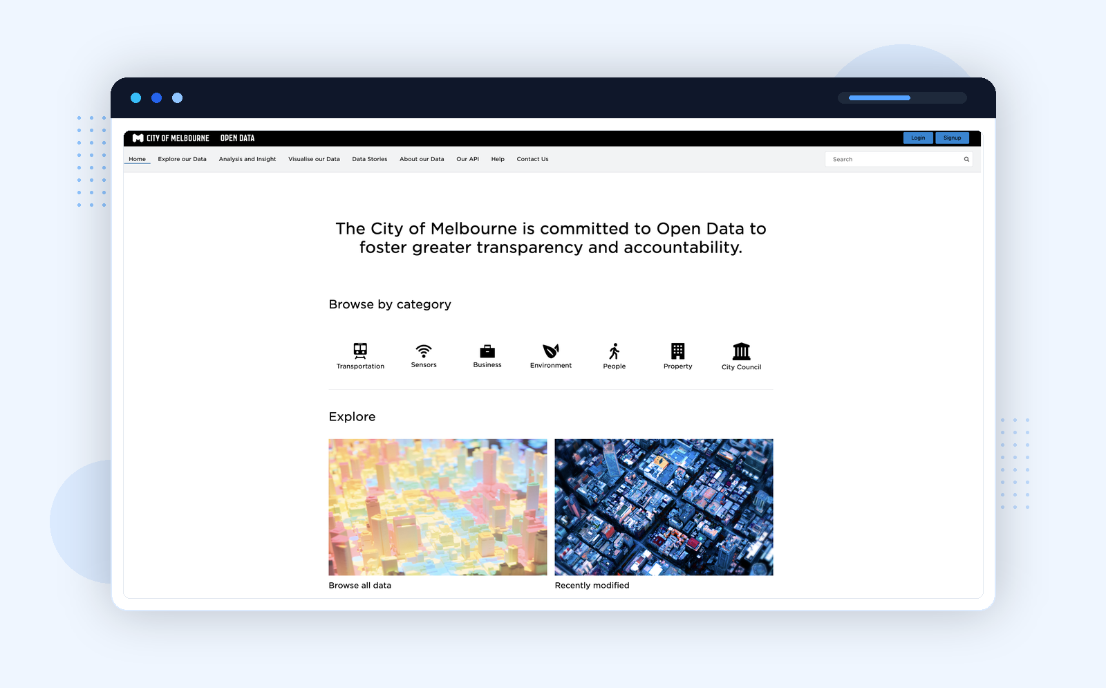
Platform: Opendatasoft · data.melbourne.vic.gov.au
Seven categories, two entry points
The category grid is deliberately compact — small enough that a user can scan all of them and identify where their question fits. The "Browse all data" and "Recently modified" entry points below the fold give power users a second route in without cluttering the primary navigation.
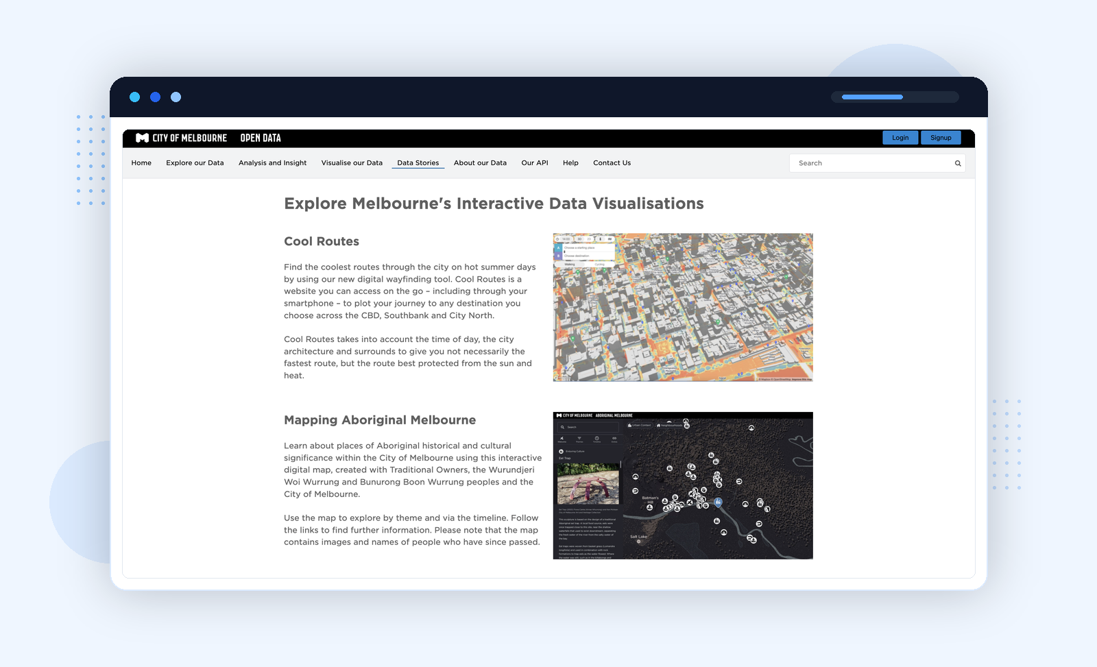
Data stories as civic arguments
The Data Stories section does something most civic portals do not attempt: it uses data to make an argument. "Cool Routes" uses spatial and sensor data to plot shade-protected walking routes through the CBD on hot days — a useful product for a city actively managing urban heat. "Mapping Aboriginal Melbourne" presents cultural and historical place data created with Traditional Owners and the Wurundjeri Woi Wurrung and Bunurong Boon Wurrung peoples — not just data about them. These are not dashboards illustrating what the data contains. They are editorial pieces that treat civic data as evidence for a claim about how the city works and who it serves.
What Makes a Civic Data Portal Effective: Key Findings
Across all twelve portals reviewed, the most effective ones do the same thing: they reduce the number of steps between a civic question and a reusable answer.
That consistently means:
- a homepage designed around user intent, not just a search box
- dataset pages with enough context to understand the data before downloading
- at least one way to explore or visualise the data in-portal
- a path to raw exports and APIs
- visible evidence that the portal is maintained and actively used
The failure modes are equally consistent across the portals that fell short: visually polished but the data is buried; all map, no raw export; data without narrative or context; no path for non-technical users beyond a keyword search.
How to Build a Civic Data Portal That Works (And What We're Building)
This research feeds directly into how we are designing the PortalJS Cloud civic data portal. PortalJS Cloud is open data portal software built specifically for civic tech use cases — not adapted from a generic CMS or a file-hosting service. The target is not "a nicer catalog." It is a portal that genuinely supports the work civic data is supposed to enable:
- find the right dataset faster — through intent-based navigation, not keyword guessing
- understand it without friction — with context, provenance, and preview before download
- visualise it without leaving the portal — charts, maps, and stories built in
- reuse it — through raw exports and open APIs
- publish narratives and stories around it — turning data into evidence, not just files
- serve both public users and internal teams — with role-based access and contributor workflows
Our civic portal demo is live at civic.portaljs.com — built on the same PortalJS Cloud stack that powers Ann Arbor's open data portal and continues to evolve as this research progresses. If you are evaluating open data portal software or planning a civic data portal build, talk to the team at Datopian — we have built portals at this standard before and can help you scope what yours needs.
This is Part 1 of an ongoing research series. Upcoming posts go deeper on specific patterns: homepage design, dataset page structure, finance portal models, public safety accountability portals, and what each pattern means for a PortalJS Cloud implementation.